Sometimes kitchens can look a little bland and boring all in one color or finish. On some of my kitchen remodels I recommend making the island a contrasting finish so that it stands out as a piece of furniture or relieves some of the monotony of the cabinetry. When I do that I often find I need to change the counter there too. The kitchens then become sort of a two tone scheme, where there is a light counter on the dark cabinet and vice versa. This design is not for every situation but it does work well in many instances.
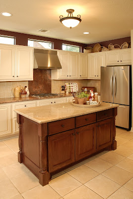
In the remodel above, the island really becomes the centerpiece of the kitchen with a beautiful wood finish and details like turned legs. The counter is a textural limestone, coral reef, that brings more interest and brings everyone to the "table" of the kitchen.
A two tone scheme here was created, white counter on dark island and dark counter on white perimeter cabinets.
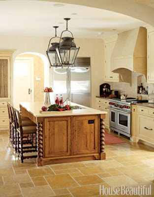
A new stained wood island becomes an added quality feature in this remodeled kitchen. Again, light counter on darker island, dark counter on light perimeter cabinets. I'm doing a kitchen now where we have wood perimeter cabinets and a painted island. Still contrasting, just the other way around.
You can see what I mean. On both of these last two, we kept the existing floors for budget purposes. The floors were so light that going with the contrasting island really helps give some definition in the spaces.
The following designers also utilized a contrasting island to add interest and break up the space.
Jim Howard - House Beautiful
Suzanne Lantz - Traditional Home
Healing Barsanti - House Beautiful
Joan Nemirow - Traditional Home
Christopher Peacock - House Beautiful
Dee Dee Taylor Eustace - Traditional Home
Nancy Bozhardt - House Beautiful
Stanley Hura - Traditional Home
Barry Dixon - House Beautiful
Loving some contrast in the kitchen!


0 comments:
Post a Comment