After many years of career, kids and caring for elderly parents, Ana and Bob decided it was time to retire and enjoy the fruits of their labors.
That's when they looked around and noticed it had been a while since they had paid much attention to their home - and even longer since they had upgraded. They decided that if they were going to be spending more time at home, it needed to look a lot better than it did.
Ana has a love and a need for rich warm color. We spent hours pouring over fabrics, but eventually she found the ones that spoke to her - and from them we had our palette - Golds, Russett Reds, Greens and a touch of dramatic Black. Each design decision was made with Ana and Bob, who participated fully and frequently shopped me into the ground! I grew to love these delightful people who truly loved their home and wanted it to be comfortable and beautiful.
The Kitchen
dropped flourescent ceiling
vinyl flooring
popcorn ceiling
dated wallpaper
dated oak cabinets (but good quality)
old appliances
dated tile backsplash
formica countertops
 ANA and BOB'S KITCHEN (BEFORE)
Notice the teal carpeting and vinyl flooring.
The kitchen had some great things going for it too,
including a garden window, french doors, and space.
ANA and BOB'S KITCHEN (AFTER)
The solution
The solution
We kept the cabinets and painted them a creamy white
added wood trim and moldings all the way to the ceiling for a custom look.
Removed the flourescent lighting and raised the ceiling,
Installed dark granite countertops
created a window valance
added a tumbled travertine backsplash with bronze accents
changed the vinyl to hardwood floors in a deep rich brown
purchased a new stainless steel sink, faucet and stainless steel appliances
efficient can lighting and pendant lighting over the island
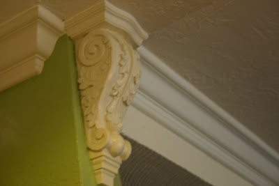
trimmed the island out with columns, feet and corbels
painted the walls a fresh green

We also added bronze hardware to the cabinetry,
and I applied an antiquing wax onto the cabinets and buffed them to a hard shine.
We set the 4" tumbled travertine tiles for the backsplash on the diagonal
and used 8" bronze tiles for the centerpiece behind the range.
Kitchen Dining Area
the problems
teal green carpeting
dated light fixture
too large dining table and chairs
more dated oak - china cabinet
no crown molding
no window treatment
floral 70's wallpaper with chair rail border
The Solution
installed deep rich hardwood floors
fresh painted walls
added crown and base moldings
vintage smaller scale dining table and chairs
upholstered the chairs in new fabrics
created window valance
can lighting installed as well as vintage chandelier
painted oak china cabinet same color as kitchen cabinets
added some new accessories, artwork and family photos
GUEST BATHROOM
This room has to be the most dramatic makeover!
The Problems
Completely covered in teal wallpaper
white faux marble countertop and sink
dated tile flooring
teal painted cabinets
paper blind on door
dated light fixture
acrylic shower enclosure
old fixtures
- it was a time machine to the 1980's.
GUEST BATHROOM (AFTER)
the solutions:
the solutions:
The only thing we kept were the cabinets
repainted them a creamy white
removed wallpaper and painted the walls
added crown and base molding
new toilet and sink
new light fixtures
beautiful semi-custom cabinet with granite top
mirror in a beautiful frame.
added brushed nickel pulls
travertine flooring with etched travertine insets and onyx mosaic border
new brushed nickel fixtures
frameless glass door
opaque glass in the door and a decorative valance
FAMILY ROOM

FAMILY ROOM (BEFORE)
The family room was an awkward space with oversized furniture and also acted as a walk through to the guest bedroom and bath.
teal green carpeting
pink wainscoting with floral wallpaper
oversized leather furniture
too small area rug
oversized television
popcorn ceiling
teal green carpeting
pink wainscoting with floral wallpaper
oversized leather furniture
too small area rug
oversized television
popcorn ceiling
Dunn Edwards 'Tortilla' paint freshened and brightened the room.
Deep rich hardwood flooring and a colorful, larger, area rug warmed it.
A flat screen television installed on the wall created more space.
Console below the television added space and held electronic components
Deep rich hardwood flooring and a colorful, larger, area rug warmed it.
A flat screen television installed on the wall created more space.
Console below the television added space and held electronic components
 We arched the doorway
added crown and base molding
purchased a custom sized sectional - opening up the room
matching chair and a half
framed precious family photos to mingle with artwork on the walls
FORMAL DINING ROOM (BEFORE)
The formal dining room furniture was lovely but lost in a dark and dated room. The chair seats needed recovering and some of the chairs needed repair. Dark gold carpeting and a lot of clutter. Vintage light fixture was too small. Wallpaper covered the walls and sheer draperies were on the large picture window. Despite the sheer window covering, the room was dark.
FORMAL DINING ROOM (AFTER)
Bringing light into the room was important. We added wall sconces and a more substantial handpainted chandelier. White wood blinds were installed on the large picture window for privacy, while still letting light into the room. Hardwood flooring was carried from the kitchen into this room and a beautiful rug was added. The chairs were repaired and recovered with coordinating fabric. Artwork was purchased hung over an antique sugar stick leg table. Fresh wall paint and accessories were added and custom silk draperies and valance were made for the window.
 The effect is warm and bright - all the darkness is gone.
  A sideboard provides a serving area. I customized the lampshades with silk fabric that coordinated with the room. Spiral rosemary topiaries bring the outdoors in.
FORMAL LIVING ROOM (BEFORE)
This was a hot mess. The faux lava rock fireplace dated to the 70's when the house was built. Flooring and upholstery needed a change as well as upholstery and draperies. In spite of the plain white walls, the room was dark and heavy.
 We addressed the faux lava rock first. Then, after crown moldings and paint (Dunn Edwards "Golden Gate") we addressed the flooring - bringing in the same hardwood flooring that was used in the kitchen and dining room.
FORMAL LIVING ROOM (AFTER)
We repurposed the furniture in this room, recovering her quality bergere chairs and sofa and keeping the tables and cabinets. A richly colored rug was added to define the seating area and for warmth.  We created a custom mantel and surround, finished out with remnant granite from the kitchen. A few new accessories were mixed with Ana's treasures.
 We created a custom mantel and surround, finished out with remnant granite from the kitchen. A few new accessories were mixed with Ana's treasures.
 In the evening light the room is warm and inviting. The final touches added were custom silk draperies and placement of artwork..
ENTRY (BEFORE)
The entry was dark and outdated with brown ceramic tile, dark carpeting, and dark wood furniture.
Large cabinets and accessories overpowered the space. A 70's brass lantern style lighting fixture hung from the ceiling.
Large cabinets and accessories overpowered the space. A 70's brass lantern style lighting fixture hung from the ceiling.
ENTRY (AFTER)
We used 20" travertine tiles with bronze accent inserts for the flooring. The Living and Dining Room wall color was continiued here. A beautiful new wrought iron chandelier replaced the brass and glass from a previous era.
A new console table accented with buffet lamps and custom shades is now the focal point on entering Ana's home. Beautiful artwork sets the mood and introduces the color scheme.
STAIRCASE (BEFORE)
Visible from the entry is the staircase - in all its 70's see-through style. On the landing, a faux stained glass window had seen better days and was deteriorating. The metal and oak railings begged for an update.
The stairs were enclosed and drywalled - no more see through style.
A new beveled and stained glass window replaces the old one and shimmers like a jewel.
New wrought iron railings added beauty, as did the new chandelier.

Upstair Hall Bath

UPSTAIRS BATHROOM (BEFORE)
The upstairs bathroom, with demolition already started, was a blank slate - with the original 1970's light fixture still intact.

UPSTAIRS BATHROOM (AFTER)
A furniture grade mirror and vanity with marble top in a deep wood tone was our starting point.
 We took the travertine tile from the floor half way up the wall and topped it with a beautiful mosaic listel. A watercolor and richly toned towels are the perfect accents.
  More travertine for the tub surround, new polished chrome fixtures and a frameless glass enclosure complete this room.
 MASTER BEDROOM (BEFORE)
I saved the best for last. Ana and Bob's master bedroom was roomy but dated.
MASTER BEDROOM (AFTER)
I chose a fresh green for the wall to complement Ana's favorite color choice of Coral which we used in the silk embroidered drapery panels, valance and bedding. We added just a simple piece of artwork and bedside lamp - leaving the bed and bedding as the focal point of the room.
MASTER BATH (BEFORE)
The toilet and shower were in a tiny room - the master shower was literally 3 foot x 3 foot. That was definitely unacceptable. Time to have a conversation with the contractor.
 The dressing area, including the sink, was open to the rest of the bedroom.
MASTER BATH (AFTER)
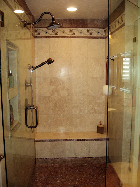
We borrowed a little space from the bedroom and the dressing area and constructed a sumptuous walk in shower. We closed the sink and shower areas off from the bedroom. We installed a furniture quality free standing vanity with granite counter and created a backsplash with listeles in marble. We hung a beautiful framed mirror above the vanity and installed new bronze fixtures and vanity lighting. The floor is travertine in classic color.
The 4 x 6 shower uses classic travertine with red travertine and roja marble mosaic, bringing in the coral color that Ana loves. The shower is enclosed on 3 sides with frameless glass. (notice the reflection in the mirror)
Ana and Bob are happy and comfortable spending time in their home. The changes that were made were calculated to add value to their home and create beauty and comfort. Most importantly, Ana and Bob were both very involved in the choices made and in color and fabric selection. When they walk into a room, it is their room, and a designers room in their home.


0 comments:
Post a Comment